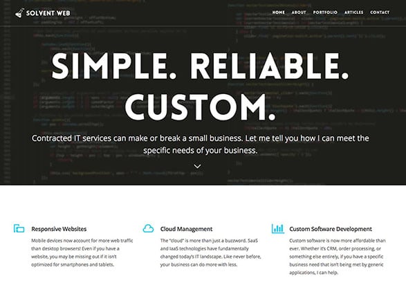
When it comes to down to it, your website is essentially your virtual storefront. This means that just like in real life, a bad first impression can have a negative impact in the form of loss of potential conversions. Around 94% of first impressions are design driven. Businesses looking to dominate in their respective industries should be focused on the best website layouts for maximum user experience (UX) and conversions.
Visit QA Graphics’ Website to See Our Layout
Layout Does and Don’ts
DO
- keep it consistent—from font size and layout options to minimizing distractions
- use responsive web design—keep up with good user experience (UX) layouts
- use code that is search engine optimization (SEO)-friendly—make sure you’re optimizing your rank in search engine result pages (SERPs)
- have a landing page—keep track of where your potential customers are coming from

DON’T
- go with a generic template option—create a custom website that stands out
- have a disorganized or cluttered site—make it easy to read/navigate
- let potential customers leave the page without clicking on a call-to-action or filling out a form
- use print that is too small—no customer wants to pinch & zoom to see what they want
![]()
Benefits
- Creating a stand-out, custom site will give you a competitive advantage
- Having a professional, aesthetically pleasing site will help build credibility & trust with your potential customers
- A good web layout can help with SEO & can boost you higher in Google’s rankings
Need Help Starting a Custom Website for your Small Business Website? QA Graphic’s partner and Web Developer, Andrew Cox can help at: https://www.qawebllc.com/


Leave a Reply